
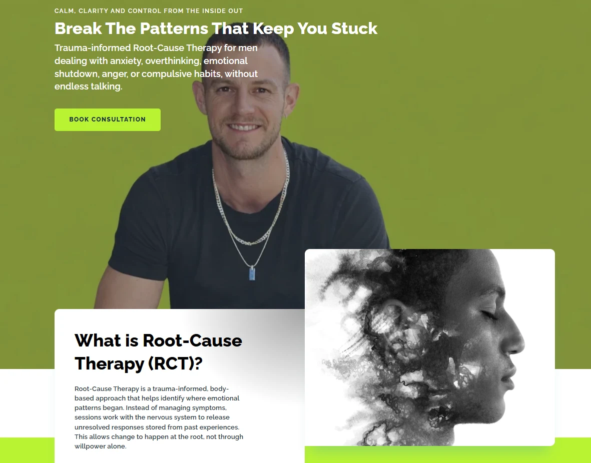
Match the page to one dominant intent
A visitor should understand what the page offers within seconds. Use the headline, supporting copy and primary action to answer who the offer is for, what problem it solves and what happens next. Avoid forcing visitors to decode generic slogans before they understand the service.
Strengthen calls to action with context
CTA text should describe a meaningful next step: request a quote, start a project, check availability, add to cart or book a consultation. Repeat the primary action after sections where the visitor has gained enough information to decide. Secondary actions can support research, but they should not compete visually with the main path.
Reduce form friction
Ask only for information you can actually use at that stage. Label every field clearly, show errors next to the relevant input, preserve entered values after validation and make the mobile keyboard type appropriate. If a longer form improves lead quality, explain why the information is needed.
Use proof where doubt occurs
Testimonials, project examples, process explanations, security assurances, delivery details and transparent pricing signals work best near the objections they answer. Generic badges without context are weaker than specific evidence.
Measure and test meaningful changes
Define the primary conversion and the supporting events that lead to it. Use analytics and recordings to identify friction, then test hypotheses one at a time when traffic volume supports it. A/B testing very low-traffic pages can produce misleading results, so qualitative evidence and usability review may be more useful first.
Common questions.
What is a good website conversion rate?
There is no universal target. Conversion rate depends on traffic quality, offer, price, market, device and the action being measured. Compare like-for-like periods and focus on qualified outcomes.
Should I remove all navigation from landing pages?
Sometimes focused campaign pages benefit from reduced navigation, but informational and organic landing pages often need helpful internal links. Match the layout to the user journey.
What should I test first?
Start with high-impact uncertainty: the offer, headline, CTA, form friction, pricing explanation or proof. Decorative micro-changes rarely matter as much as clarity.